Cross-discipline is essential and goes beyond just handing over work. Primarily, knowledge is shared across multiple teams and disciplines. When key information isn’t siloed by an individual/ team, problems can be spotted early on.
Close collaboration between design and engineering helps establish a universal source of truth that helps a development team build the right thing correctly as one cross-functional unit.
Designers and engineers can be seen to speak two different languages, but there should be a shared interest in speaking the same language to find common ground and mitigate differences.
Here are some valuable processes to establish that “universal language” between the two groups using design systems
Componentisation
This is instrumental in establishing a universal language as all UI elements are coded and designed as individual components. Once this is done, a predefined component can be combined and stored in a UI library or a Design System, which is shared across design and engineering. Alternatively, UX designers can use tried and tested components to assemble prototypes for user testing and this benefits engineering because they now have a clear source of truth for design.
Example:
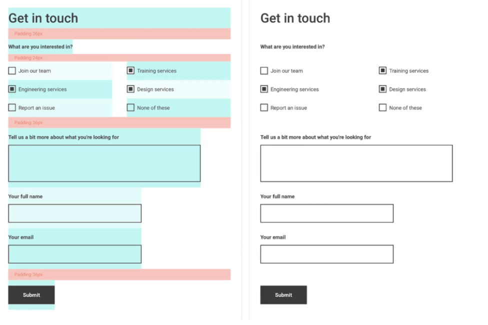
Here’s the basic UI element from the YLD website.

In the image, you can see the section title (Get in touch), subtitle (What are you interested in?), and padding elements (the red fields).
The fixed height and paddings have their respective blocks so they can be easily stacked on top of each other.
When the design team supplies visuals to engineering, they provide them with both components, as shown on the screenshot.
The consistent spacing and sizing from the components are handed over to the engineering team, allowing them to then code in the same way, using the same stacking principles. Thus, achieving a shared way of working.
Baseline Grids
This is an invisible structure that helps organise UI components and set rules to systemise UI, using multiples of base units to define all the other UI dimensions, paddings and margins.
The most popular base unit to use is “8”, as most popular screen sizes are divisible by 8.
They create a clear visual hierarchy by only using multiples of a particular number as it’s easier to spot inconsistencies, and it’s one less thing to think about, whether designing or coding.
Example:
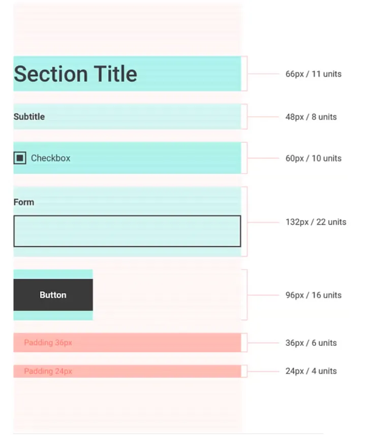
Baseline grid of 6/ 6-point grid (6 pixels)
Each component has a predefined height which we can read by pixels or the number of units used. For this example, 1 unit = 6 pixels. In this case, this is how controlled, and consistent sizing is achieved in line with componentization.

Finally, getting engineers involved early in the process to help reduce issues and highlight alternative solutions.
Some best practices
- Keeping general communication channels open throughout the project lifecycle will make it easier for everyone to get things done successfully.
- Regularly share prototypes or ideas of upcoming features for engineering to stay aligned and allow them to highlight alternative solutions.
- Listen to feedback and input from each other, and allow everyone the space to have an opinion and come up with input
- Be willing to compromise if and when needed after receiving feedback
- Use tools both design and engineering teams can access and collaborate on, especially for handover, such as Figma, InVision and Sketch.
Hopefully, these quick tips will help set you up for success — enjoy and have fun!
If you’re looking to join a collaborative team of great designers and engineers who love working together, feel free to contact us at YLD.


